

Mobile friendliness improves SEO by enhancing user experience, boosting page performance, helping websites rank in mobile search results.Mobile devices have become an important way for people to access websites, search for information, read articles, shop online, and interact with businesses.
Because of this, creating a website that works well on smartphones and tablets is an essential part of modern SEO.Mobile friendliness means making a website easy to use on smaller screens. Visitors should be able to read content, navigate pages, click links, and complete important actions without needing to zoom, scroll excessively, or deal with broken layouts.
What Is Mobile Friendliness?
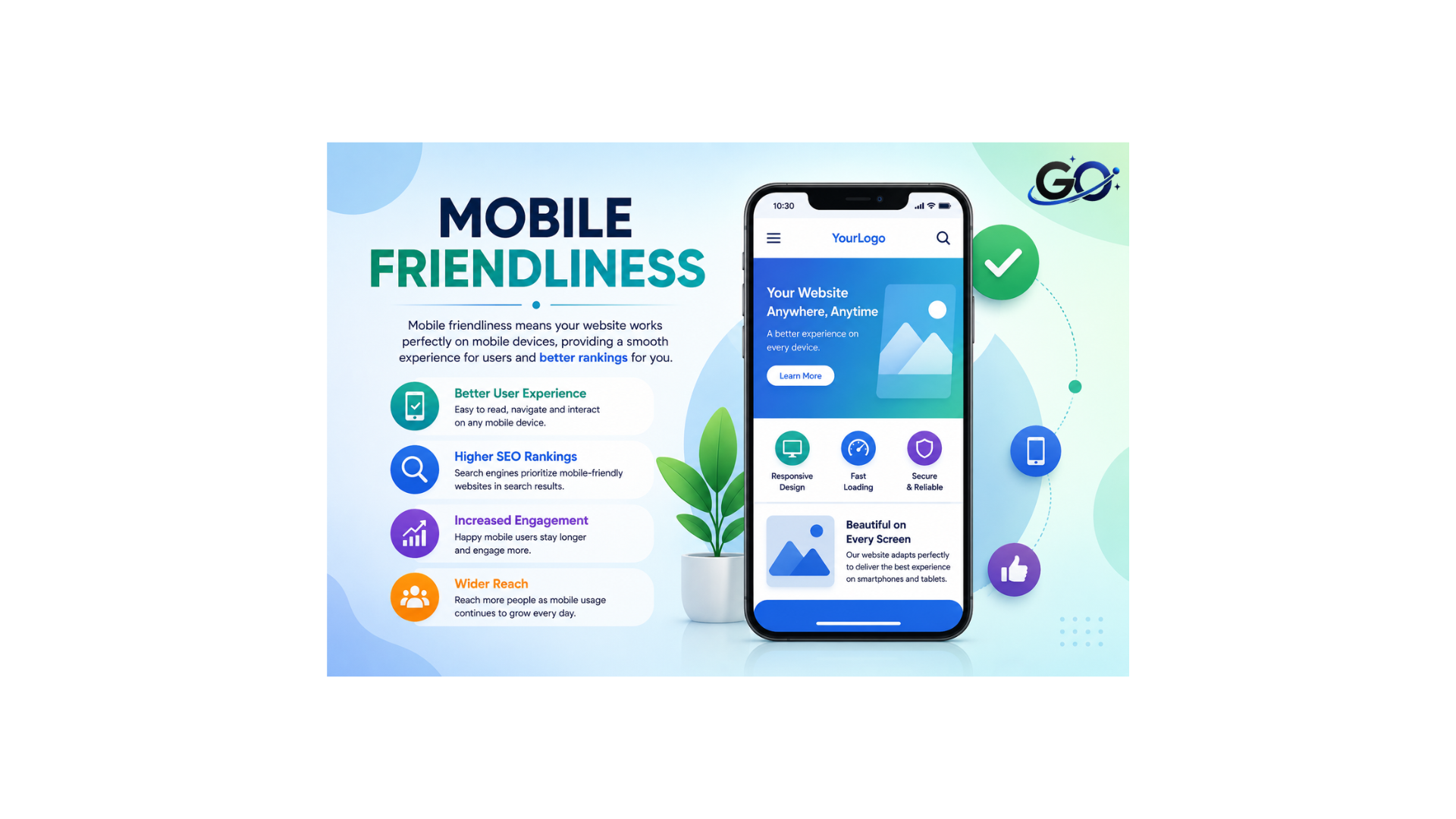
The degree to which a website is optimised to load on a mobile device, like a tablet or smartphone, is known as mobile friendliness.
In layman’s terms, it’s when your site is able to shrink down to fit on any screen while still allowing users to consume content, navigate the site and achieve their goals as easily as with the desktop version. It also means not throwing up intrusive or aggressive interstitial ads that block your content on mobile devices.
Why Is Mobile Friendliness Important for SEO?
Mobile friendliness is important for SEO because a large number of searches and website visits happen on mobile devices. If a website is difficult to use on a smartphone, visitors may struggle to find information or complete important actions.Google’s mobile-first indexing also makes the mobile version of a website particularly important. If important content is missing from the mobile version, search engines may not have access to the same information available on desktop.
By making content easier to read, navigation simpler, and pages more comfortable to navigate, a mobile-friendly website can improve user experience.But mobile friendliness is just one aspect of SEO. Links, search intent, technological performance, content quality, and relevancy all important.
Use a Responsive Web Design
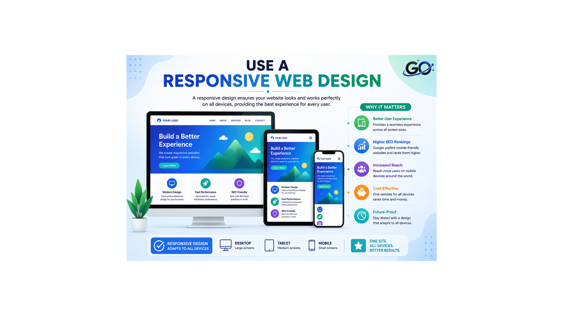
Your website will function properly on PCs, tablets, and mobile devices if it has a responsive web design. It automatically adapts the content, fonts, graphics, and layout to various screen sizes. By making pages simpler to read and navigate on any device, this enhances the user experience. By making your information easier for search engines to comprehend and access, a mobile-friendly design can also aid with SEO. As a result, responsive design is crucial to building a website that is quick, accessible, and easy to use.
Optimize Images for Mobile Devices
Optimizing images for mobile devices helps improve website speed and create a better user experience. Large images can take longer to load on smartphones and may use more mobile data. Resize images to appropriate dimensions, compress file sizes, and use modern formats such as WebP or AVIF when suitable. Responsive images can also adjust to different screen sizes, helping pages load efficiently without reducing visual quality. As a result, mobile image optimization can support faster performance, improved SEO, and a smoother browsing experience.
Improve Mobile Page Speed
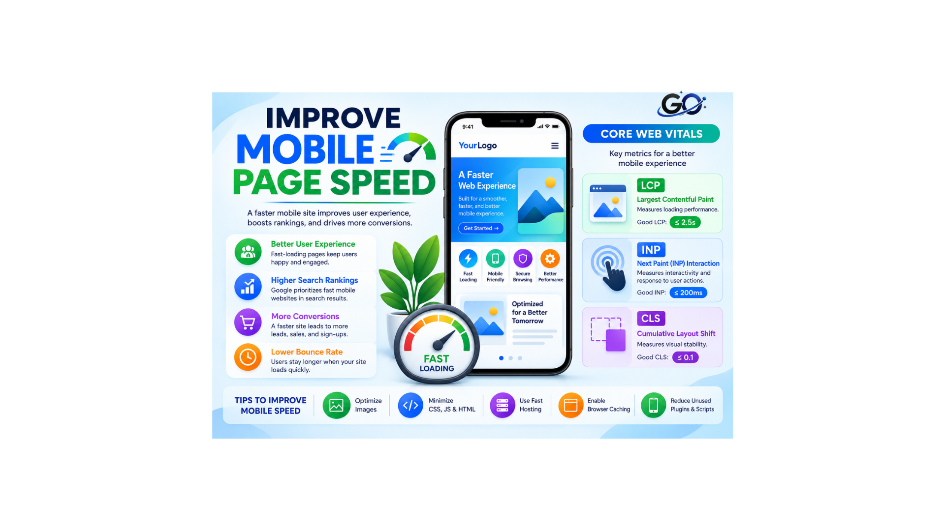
Making sure your webpages load quickly is part of providing a good page experience, which is crucial for ranking well in Google search results.
More precisely, Google advises that you pass each of the three Core Web Vitals metrics, which evaluate page experience:
Largest Contentful Paint (LCP): The loading time of the primary content
Next Paint (INP) Interaction: The speed with which your website reacts to user input
Cumulative Layout Shift (CLS): The amount that your website unexpectedly moves when content loads
Check the mobile load speed of any site (especially LCP) with Google’s PageSpeed Insights to find problems that can affect your mobile SEO. .
Simplify Mobile Navigation
Smartphone navigation might not function as effectively as desktop navigation. In addition to taking up too much screen real estate, large menus can make it challenging for users to locate key pages.Make advantage of a straightforward mobile navigation system that allows visitors to access key areas without becoming overwhelmed.
Ensure that users may navigate between key pages and return to the homepage with ease.Because they offer more ways to navigate within material, internal links are also helpful.
Avoid Intrusive Pop-Ups
Google penalises “intrusive pop-ups,” particularly obtrusive interstitial pop-ups, that cover the primary content on a mobile device as soon as the page loads.
Here are some examples of things Google says you shouldn’t do. because the primary material is obscured by the pop-ups.
Pop-ups can be used to confirm a user’s age or request that they accept cookies. As long as it takes up a respectable amount of screen real estate, you can even incorporate a standard advertisement.
If you decide to utilise pop-ups, make sure they have a clear function and don’t obscure the content of your page with advertisements or other marketing messaging.
Mobile Content Optimization Strategies
It takes more than just technical underpinnings to ensure your website is mobile-friendly. Make sure your material is created with mobile consumers in mind as well.
Shorter sentences and paragraphs are preferred by many SEOs. This fits quite well with mobile optimisation strategies.
This method guarantees that your material may be viewed on mobile devices. Who wants to read a lengthy wall of text when they come upon an article? Not me.
Generally speaking, try to keep each paragraph to no more than three sentences. It’s also OK if a paragraph naturally consists of just one sentence.
Mobile Link Building Strategies
The goal of mobile link-building is to obtain high-quality backlinks that are especially beneficial for mobile SEO. This approach acknowledges that mobile consumers’ surfing behaviours and content preferences differ from those of desktop users.
For instance, mobile consumers are more likely to be visually orientated, on the go, and searching for quick solutions.
Important elements of creating mobile links consist of:
Mobile-Friendly Domains for Referrals: Give links from websites with a strong mobile presence priority.
Mobile-Optimized material: Produce material that works effectively on mobile devices and is deserving of links.
Building Local Links: Prioritise relationships and local citations for location-based mobile searches.
Social Media Engagement: Look for link opportunities on mobile-focused platforms.
App-Based Linking: Make use of deep linking techniques and app indexing
Voice Search Optimization for Mobile
The increasing tendency of consumers saying their search queries instead of typing them is accommodated by voice search optimisation, which modifies SEO tactics. With voice assistants like Siri, Google Assistant, and Alexa easily accessible on mobile devices, this change is especially noteworthy.
Important tactics consist of:
Pay attention to natural language: Make conversational phrases and queries your top priority.
Aim for long-tail keywords: Voice searches are typically more detailed and lengthy.
Put organised data into practice: Assist search engines in comprehending the context of your material
Make sure to optimise for featured snippets: Voice assistants frequently extract responses from these
Local SEO for Mobile Users
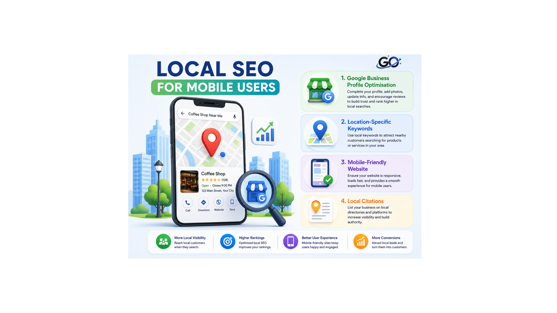
Optimising your online presence to show up in location-based searches, especially those that contain “near me” or other specific geographical terms, is the main goal of local SEO for mobile users. Given the growing localisation of mobile searches, this tactic is essential.
Important elements of mobile-friendly local SEO include:
Google Business Profile Optimisation: Make sure your profile is accurate, comprehensive, and current.
Location-Specific Keywords: Use regional vocabulary in your metadata and content.
Mobile-Friendly Website: Make sure your website loads quickly and is simple to use on mobile devices.
Local Citations: Ensure that NAP (Name, Address, Phone) data is consistent among internet directories.
Common Mobile-Friendly Mistakes
Common errors that might have a detrimental effect on a website’s functionality on mobile devices and in mobile search results are known as mobile SEO hazards. Strong mobile SEO is maintained by recognising and resolving these problems.
Important problems and fixes include of:
Hidden material: Make sure that all material is accessible on mobile devices without the need for desktop reroutes.
Inappropriate Redirects Use server-side redirection or responsive design.
Slow Loading Times: Optimise photos and turn on compression
Non-Responsive Design: Make sure your website is responsive across all platforms.
Blocking Resources: Make sure crawlers can access CSS and JS files
Mobile SEO Tools and Resources
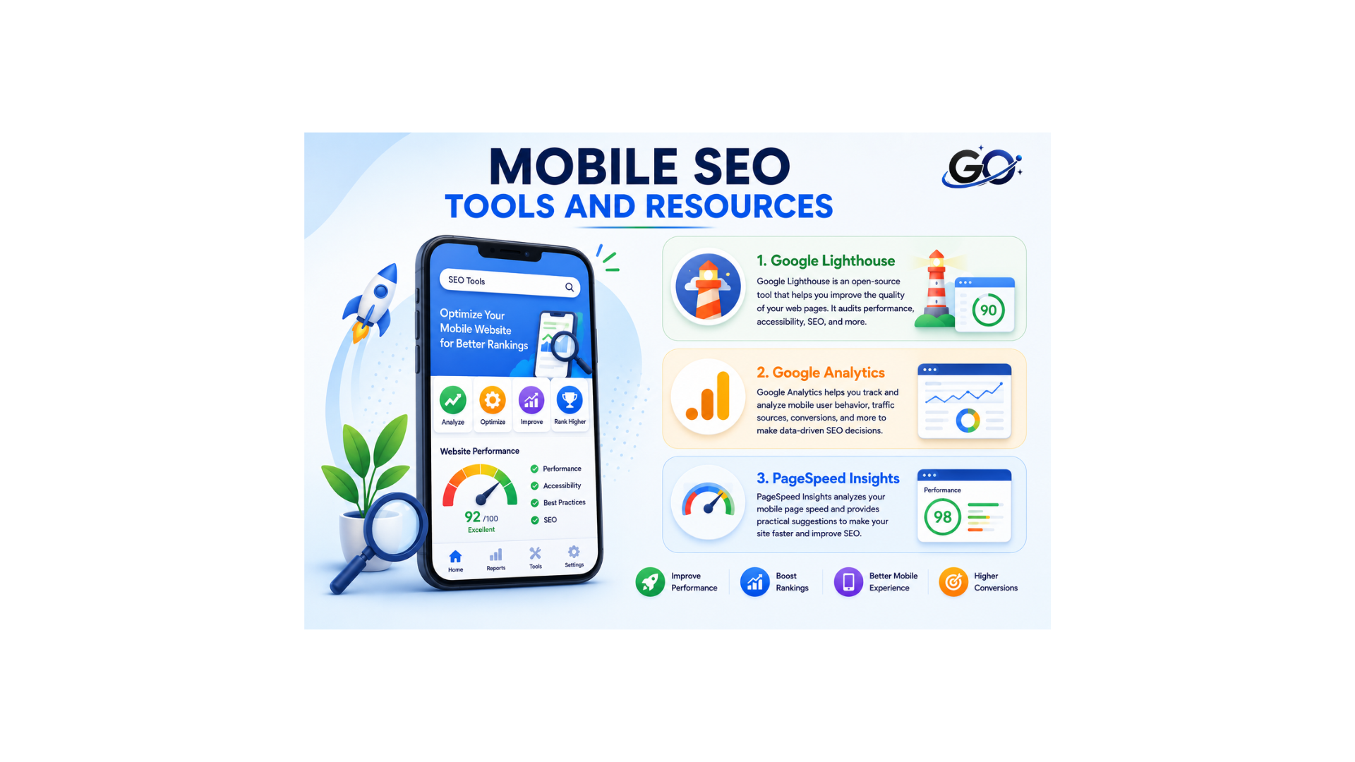
In order to optimise websites for mobile devices and improve user experience and search engine results, mobile SEO tools are crucial. These tools analyse performance, offer suggestions for improvement, and assist in locating and resolving mobile-specific problems.
Important mobile SEO resources consist of:
Quickly determine whether a page is mobile-friendly with Google’s Mobile-Friendly Test
Google Lighthouse: Evaluates mobile page performance, accessibility, and SEO
Google Analytics: Offers statistics on user behaviour unique to mobile devices
PageSpeed Insights: evaluates and recommends enhancements for mobile page speed.
Google Search Console: monitors website performance, indexing status, search traffic, and SEO issues.
Conclusion
Mobile friendliness is an important part of modern SEO and website usability. With mobile-first indexing, the mobile version of a website needs to provide important content and functionality in a clear and accessible way.Use responsive design, optimize images, improve page speed, simplify navigation, make buttons easy to tap, and avoid layouts that require horizontal scrolling.
Above all, test your website frequently on various mobile devices. Smartphone-friendly websites can improve user experience and complement your overall SEO strategy.